MyDeckAudit
A pitch deck intelligence platform redesigned
for clarity, trust, and a simpler path to purchase.
Overview
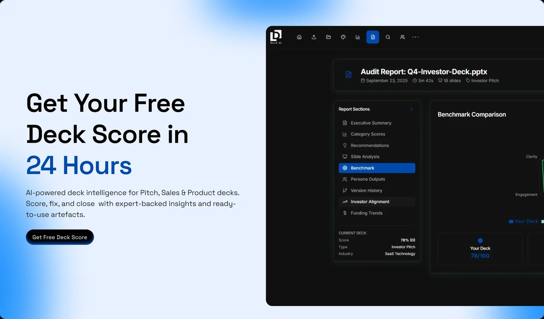
MyDeckAudit is a SaaS platform that helps founders and product teams analyse their pitch decks and identify opportunities to improve their presentations. The platform provides AI powered deck analysis, scoring, recommendations, and actionable insights to help users understand how effectively their decks communicate their ideas.
My role focused on redesigning the website to make the product easier to understand, present pricing more clearly, and create a more structured journey from discovering the platform to requesting a deck audit or purchasing a report.
The Problem
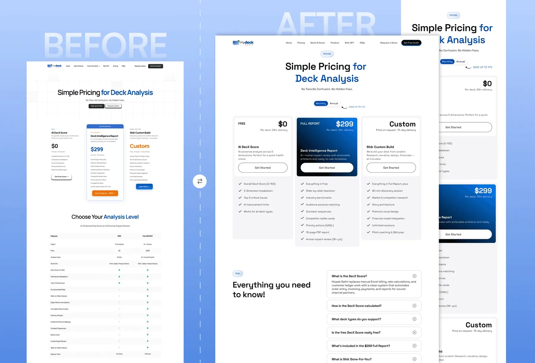
The original website communicated the product's capabilities but lacked a clear hierarchy. Important information about the analysis process, pricing options, and product value competed for attention, making it difficult for visitors to understand the offering quickly.
The pricing page presented multiple options and extensive feature comparisons without enough visual guidance. Conversion actions were scattered across the experience, while credibility signals and supporting information were not positioned effectively to help users make confident decisions.
The Approach
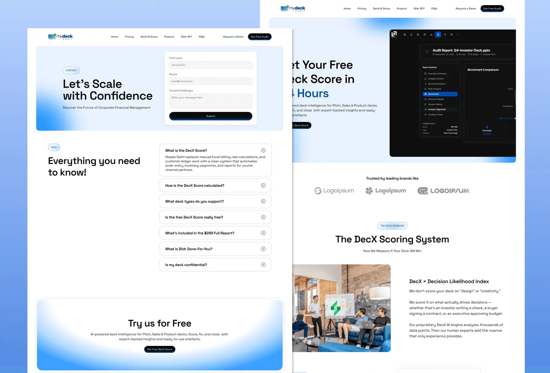
I approached the redesign by simplifying how the product communicates its value. The landing page leads with a clear proposition around pitch deck analysis, followed by structured sections that explain the platform, its scoring system, and the value of its insights.
The pricing experience was reorganised to make the available options easier to compare. The revised layout gives the free audit, full report, and custom offering clearer visual distinction, helping visitors understand the differences without navigating an overwhelming feature list.
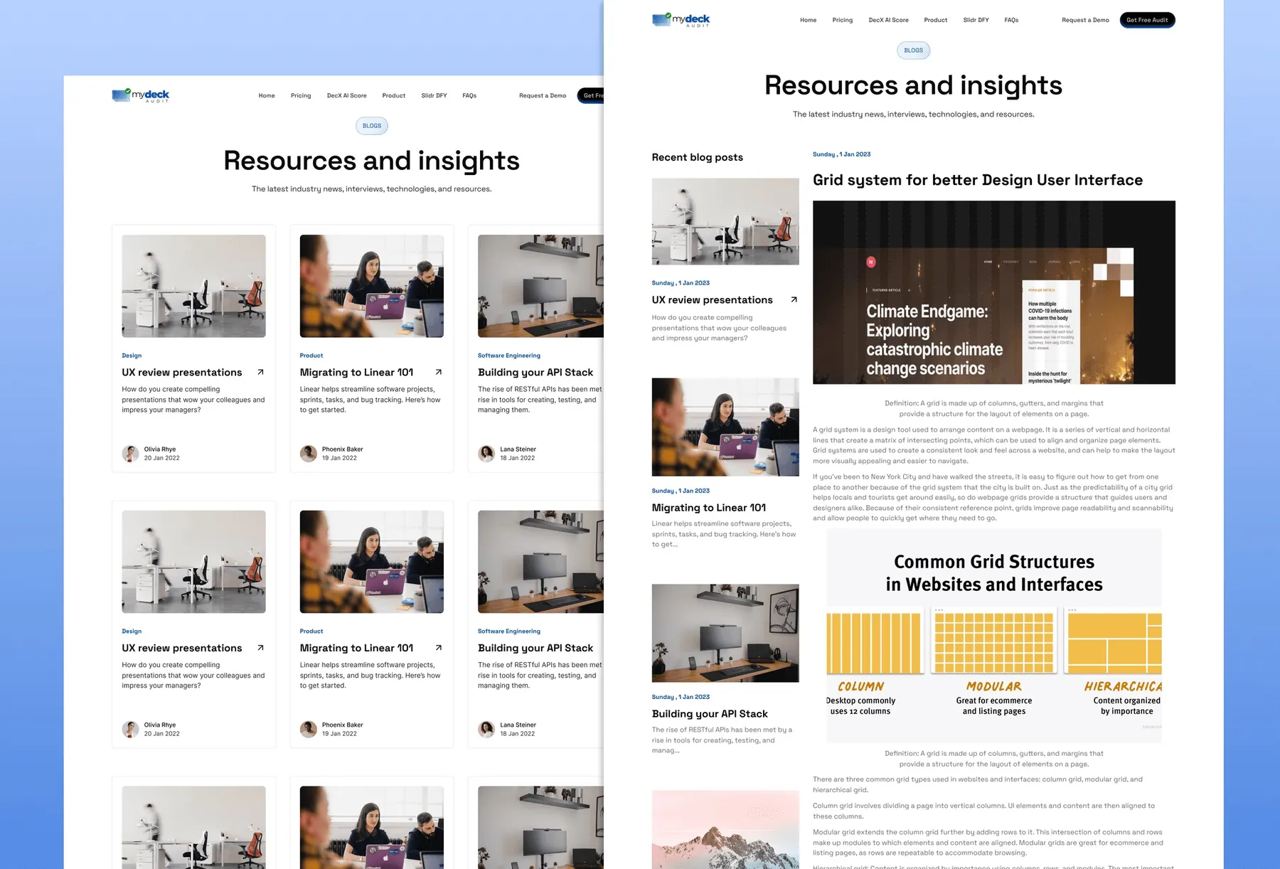
I also strengthened the supporting content through strategically placed credibility signals, frequently asked questions, and a resources section. The resource listing and article layouts create a clearer structure for educational content, while consistent typography, spacing, and subtle gradients establish a cohesive SaaS visual identity.
The Results
- A clearer landing page that communicates the product proposition earlier
- A more structured pricing experience with distinct offerings and clearer comparisons
- A consistent visual hierarchy across the landing page, pricing, and resources sections
- A more organised conversion journey connecting product discovery with audit requests and report purchases
- A scalable website structure that can accommodate future product features and educational content
What I'd Do Differently
I'd test the revised pricing structure with founders before finalising the design. Simplifying the number of visible options can reduce decision complexity, but usability sessions would help determine whether the new hierarchy makes the differences between plans genuinely easier to understand.
I'd also establish conversion tracking on the original website before launching the redesign. Without a reliable baseline for audit requests, report purchases, and drop off points, it is difficult to quantify how much the revised hierarchy and pricing presentation improve conversion performance.
What I Learned
Clarity matters more than content volume. The challenge was not simply to remove information, but to organise it so visitors could understand the product's value without working through the entire page.
Pricing is a design problem as much as a business decision. The way plans are grouped, labelled, and compared influences how users evaluate their options. A clear pricing interface should help people make informed decisions rather than overwhelm them with information.
Trust needs to appear before the final decision. Supporting information, product explanations, metrics, and credibility signals help visitors evaluate an unfamiliar platform. Their placement within the user journey matters as much as their presence on the page.